As Joe would say:
pause pause pause!
pause pause pause!
If you are planning to visit the phaenomenale festival next year, you should have a look at the new phaenomenale website for details about who is doing what and when.

the metallic printed stationary for rajek barosch landscape architects freshly arrived from the printer, who once again did a great job!

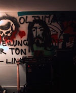
in a damp basement somewhere secretly hidden in Vienna, the HOLY HURRICANES are absorbing energy from beer, smoke and raw sounds to destroy … something.
Your tinnitus due in 2007.
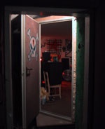

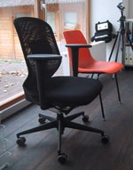
after more than a year of pain for our bums we are now seated on soft, black, cosy fabric.
We have swopped our back breakers with the new high tech Meda chairs. Kiss my ass, you chair!
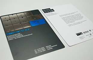
out now. the new shiny phenomenal phaenomenale postcard. guess the size.
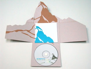
Our cd-packaging for the Matterhorns, an austrian wind quintet, was awarded at the Josef Binder awards ceremony. Their website will be updated to super flash mode very soon.
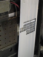
We made our first product in foil blocking and went to the printers to see how foil blocking works. Mr. Buerger, master of old-school foil blocking and chef of the Heidelberg showed us how to tune the temperature.


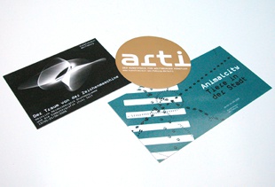
'Ungarn 1956' exhibition design, Heinrich Heidersberger catalogue and poster, Animalcity catalogue and poster, GMJO leaflet and poster as well as konzentrat* identity and stationery, all updated in our output section.

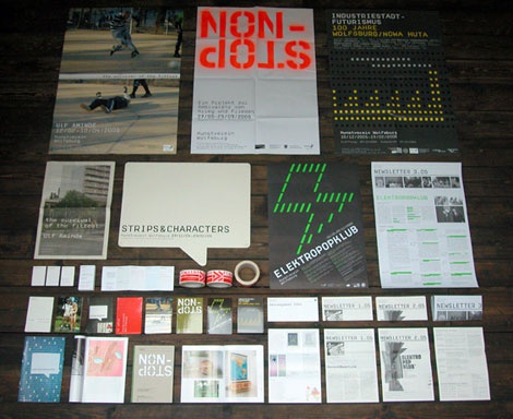
we just received a package from the Kunstverein Wolfsburg with things we designed for them within the last year.
You can have a look at the posters until we have some time to take pictures of the other pieces for our output area.
Autumn has arrived in sensomatic land btw.

in the left corner you can see Maja our new ace of spades in the design department.
Although she was in great demand by many other design studios she couldn't resist our benefits like nice coffee, a soon to be bought black chair or full control of the stereo.
Hey ho, let's go!

Moving landscapes, a reader about landscape and film, was now officially presented at the Filmmuseum, Vienna and is now officially documented in our output section (along with a few other more or less recent projects).
Fast fingered Susanne Pumhösl has now a super website. All harpsichord fans around the world can now listen to some of her music and order her cds.
And again almost no colours!
PS A harpsichord (Cembalo) looks like a piano with mixed keys but sounds completely weird.

Last night the exhibition 'Flucht nach Wien — Ungarn 1956' opened at the Wien Museum.
The museum's challenge was to fit 500 people into a 100-sqm-exhibition. The architect's challenge was to fit 300 objects into the very same space. Our challenge was to fit all texts (in two languages) and graphic information into the space left between the objects (without using the floor). The result is a very dense experience. Check it out, it's free on sundays …

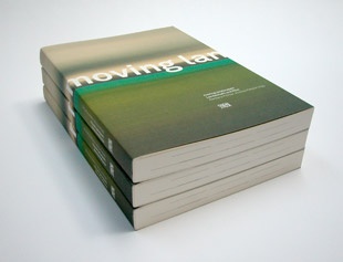
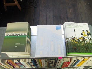
Just arrived from the printers: The 240-pages anthology 'moving landscapes' which will be presented officially on september 21st at Filmmuseum, Vienna (left). The Gustav Mahler Jugendorchester's summer programme (right). And a property agent's dream in metallic ink and glossy UV-varnish (middle).
we're closed until 28.07.
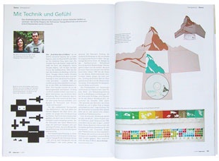
in the july/august issue of the german magazine design report you can read about us and why an how.
buy
unfortunately our soon to be intern BÃ rbara from Brasil couldn't get a visa, because the bloody Austrian authorities are afraid of anyone who can speak more than one language.
So if you are nice and have a good understanding of typography and design and good knowledge of the standard software, please apply.
We keep producing work for the Kunstverein Wolfsburg but hardly find time to archive it — so here's the latest invites. A catalogue and poster are in production.
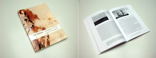
if you know the meaning of the word 'autopoiesis' then you might enjoy the new book by Mr. Dr. Friedrich Weltzien about the topic.
We designed it and received one copy.
ninjatune.net is one of the telegraphs top 40 music websites. (via kleber)
In my life before sensomatic I had the pleasure to work with the very nice people at kleber. Everybody was busy with other jobs so I had the chance to do the design for the ninjatune site ("the site is a joy to negotiate, especially the global gig-guide map" – telegraph).
End of showing off.
our start page is now very neu!
WELCOME TO THE INTERNET!
... of martha stutteregger's work at her new website.
She likes minimal design, we like minimal design. hmnml.

Six brand old original Landis have just landed on our terrace thanks to Oliver, one half of our favourite landscape designers Rajek Barosch. The chairs were initially designed for the 1939 Swiss National Exhibition in Zurich.

we know someone who knows them.
Vanessa Karré is a friend of "Wir sind Helden/We are heroes" (a German pop band). She did the design for all their latest cds and shows and even one video. She's so busy that she hasn't got time to fill her NEW WESBITE with material, but there's enough on it to get an impression.

Currently touring Italy, France, Spain, Germany and Austria: the new Gustav Mahler Jugendorchester's programme book.
we almost forgot to tell you about our one page illustration of Jane Austen's pride and prejudice (only in German).
The book with a selection of one page world literature illustrations came out more than 1 1/2 years ago but we still haven't managed to get a copy.

the new website of the documenta is so minimal we can't even put up an image (it would spoil the whole impression).
Since it is very hard to get rid of all that fancy web stuff, Viennese designer Martha Stuttegger asked us for a collaboration. The Site will get bigger in phase 2 so we might also allow them to put up a few more pictures.
this is the psycho inviation for the next exhibition at the kunstverein wolfsburg. It's not just colours, there's even an image of something you might know on it (take the title as a hint).
oh, you tiny little colourful disks ...

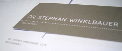
Attorney at law Dr. Stephan Winklbauer has just received his businesscards and stationery from the printers and is very pleased (off the record: he said one wants to lick it because the colour looks so delicious. mmmh).
NEW: now updated in our output section.
We are celebrating two years of design work for one of our clients in germany, the Kunstverein Wolfsburg. As we were just told by the curator, two more years are to follow.
